Client: SKYN // Website Design, 2022
Role: Art Direction, UI Design
What I did:
Led visual direction and art direction for SKYN Japan's full website revamp: defining the visual identity, designing hero key visuals, curating product imagery, and directing the UI aesthetic from concept through launch.
Collaborated with the lead UI/UX designer on user research, site architecture, and wireframing, and contributed to UI element design throughout the process.
There’s unbreakable SOFTNESS IN connection
SKYN is a premium condom brand entering Japan's unique sexual wellness landscape where nearly 77% of couples report sexless relationships, yet women are increasingly becoming the primary purchasers of contraception.
The brand needed a stronger digital entry point. The existing website felt outdated, failed to convey the product's soft, natural material, and wasn't something users felt comfortable browsing in public.
We redesigned SKYNBUN.jp from the ground up — transforming it into a premium, approachable digital experience that simplified the path to product discovery, reframed sexual wellness as something positive and open, and built a seamless conversion flow from brand experience to purchase through Amazon and local retail.
the brief
We set three clear objectives for the revamp:
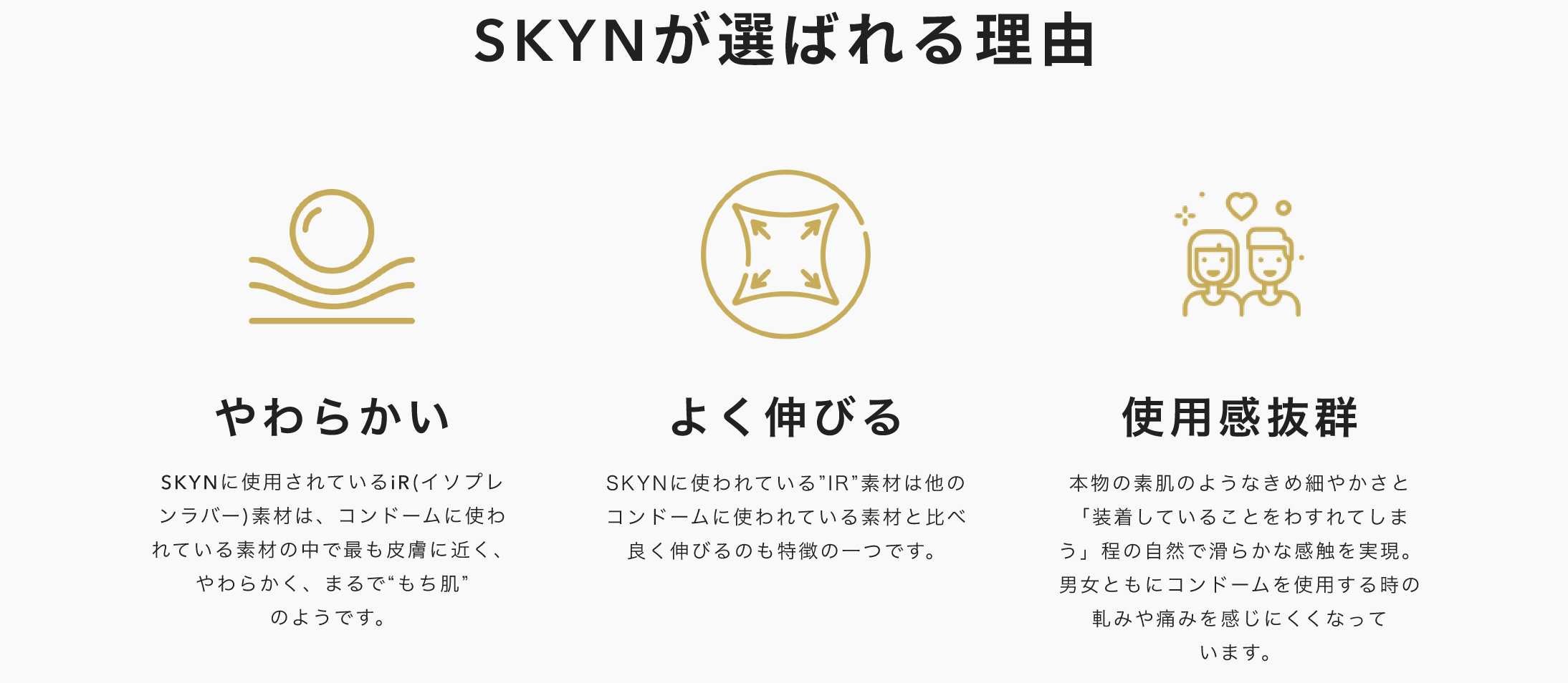
Deepen product understanding — highlight SKYN's technical edge and material quality over local competitors, giving users a reason to choose and stay.
Strengthen the brand story — shift perception from purely functional to a lifestyle brand rooted in intimacy and comfort.
Build a high-conversion gateway — streamline the journey from brand experience to purchase, whether through Amazon or local retail.
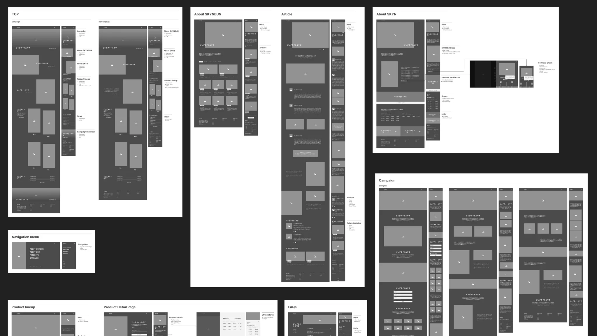
user flow
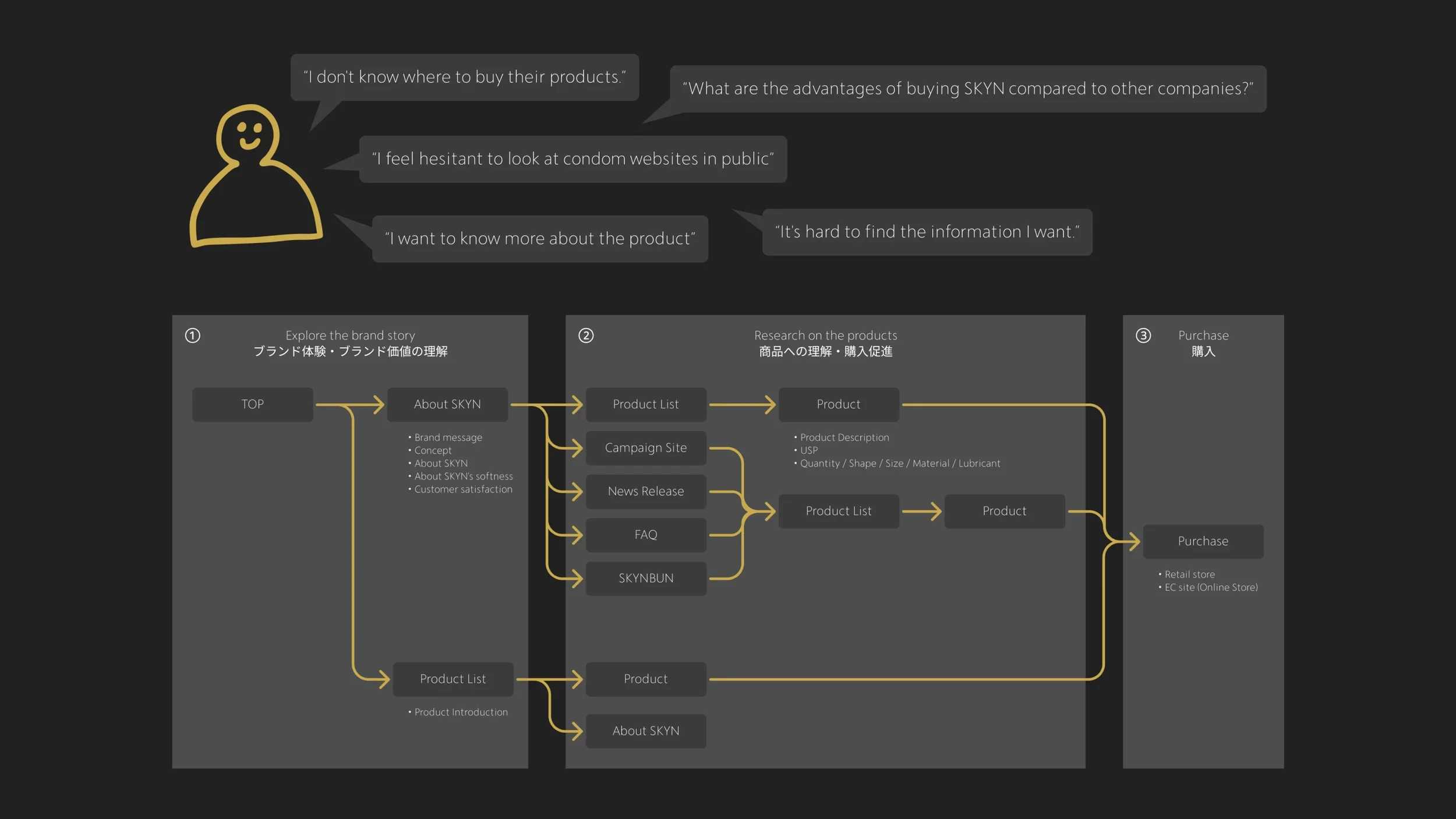
Working with the lead UI/UX designer, I helped identify pain points on the original site and map user needs against the brand's conversion funnel. My focus was ensuring the new structure supported a strong visual narrative — creating breathing room for immersive storytelling while keeping the path to product pages and purchase intuitive. We also designed the layout to be sustainable on WordPress, so the team could update content without compromising quality and swap in custom campaign homepages for seasonal activations.
Visual Direction
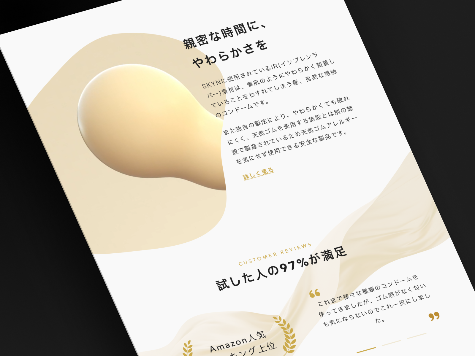
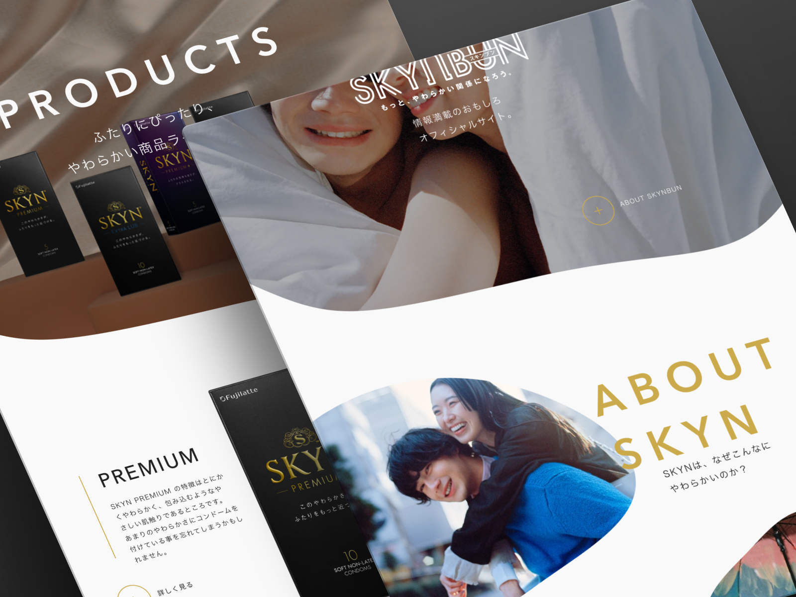
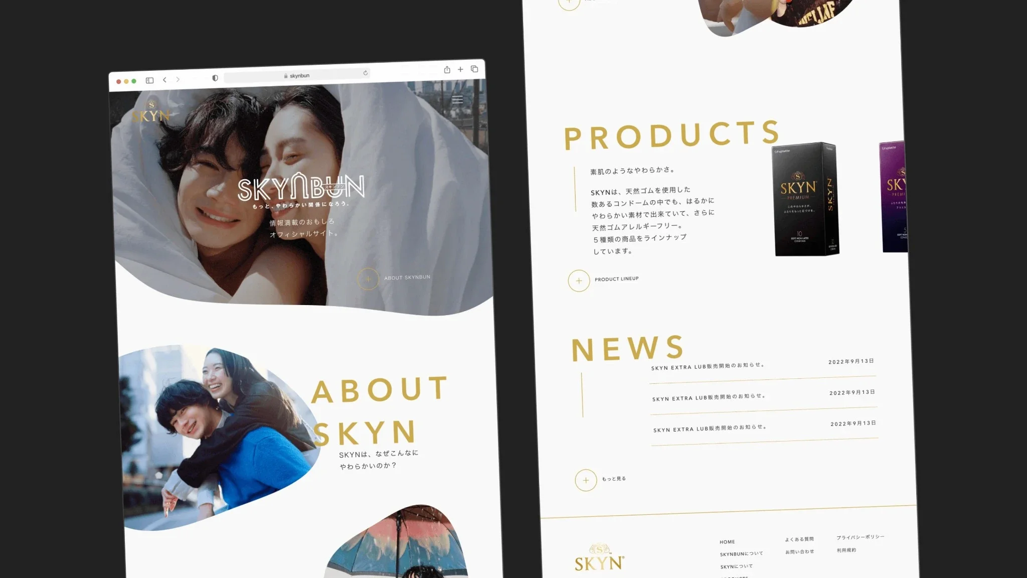
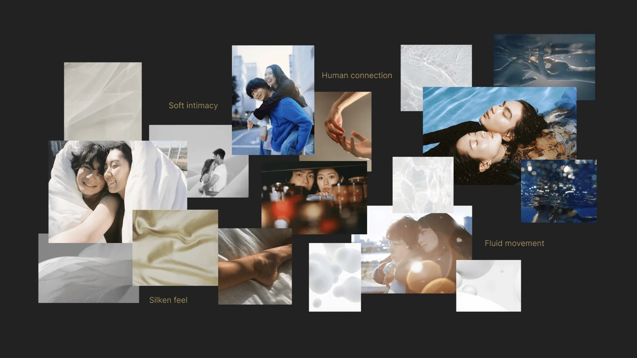
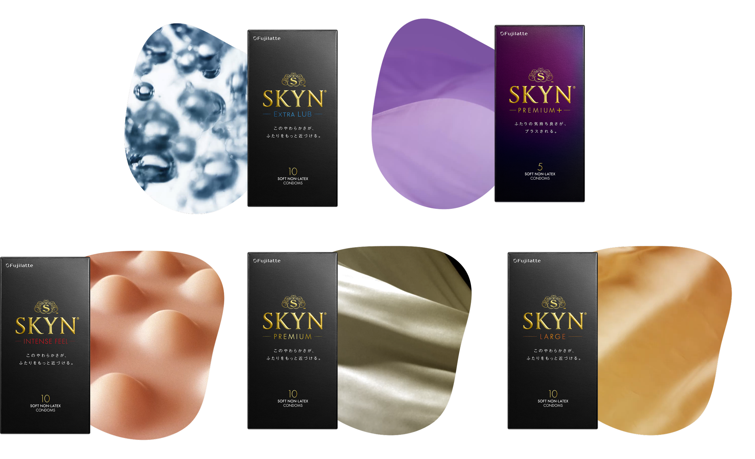
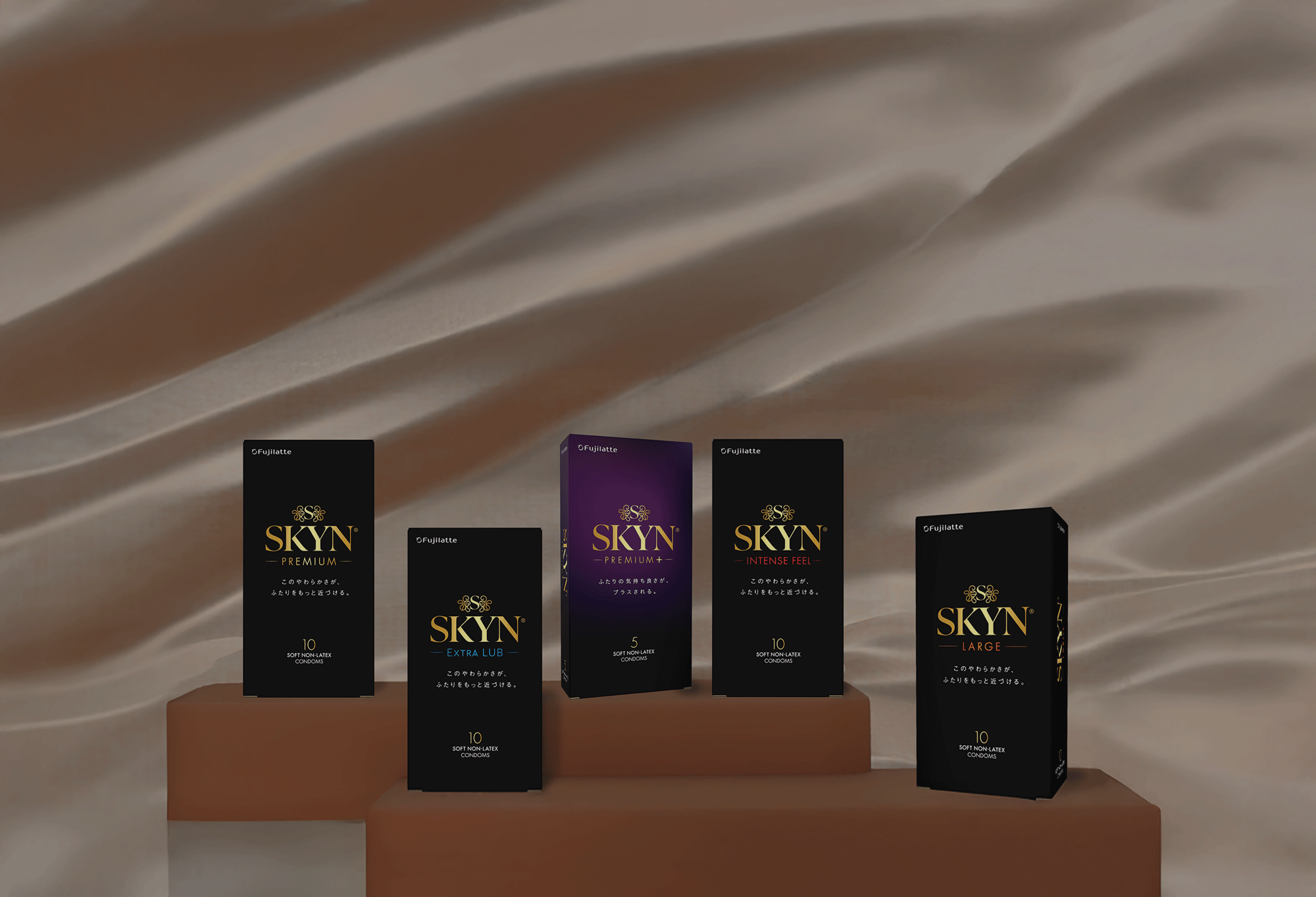
I rooted the visual language in one concept: softness you can almost feel through a screen. I designed the hero key visual and curated textural photography for each product lineup — translucency, stretch, skin-like warmth — aiming to convey a sensory impression of the product itself, not just show it. The color palette leaned into muted, warm skin tones with soft gradients, a deliberate departure from the clinical blues and whites dominating the category in Japan. Every choice reinforced the repositioning from functional to intimate and lifestyle-forward.
I worked with the lead UI/UX designer to develop UI elements that carried the visual direction through every interaction — clean type hierarchy, generous whitespace, and subtle motion cues that gave the site a breathing, unhurried quality. The goal was for navigating the site to feel less like browsing a product catalogue and more like stepping into the brand.
Outcome
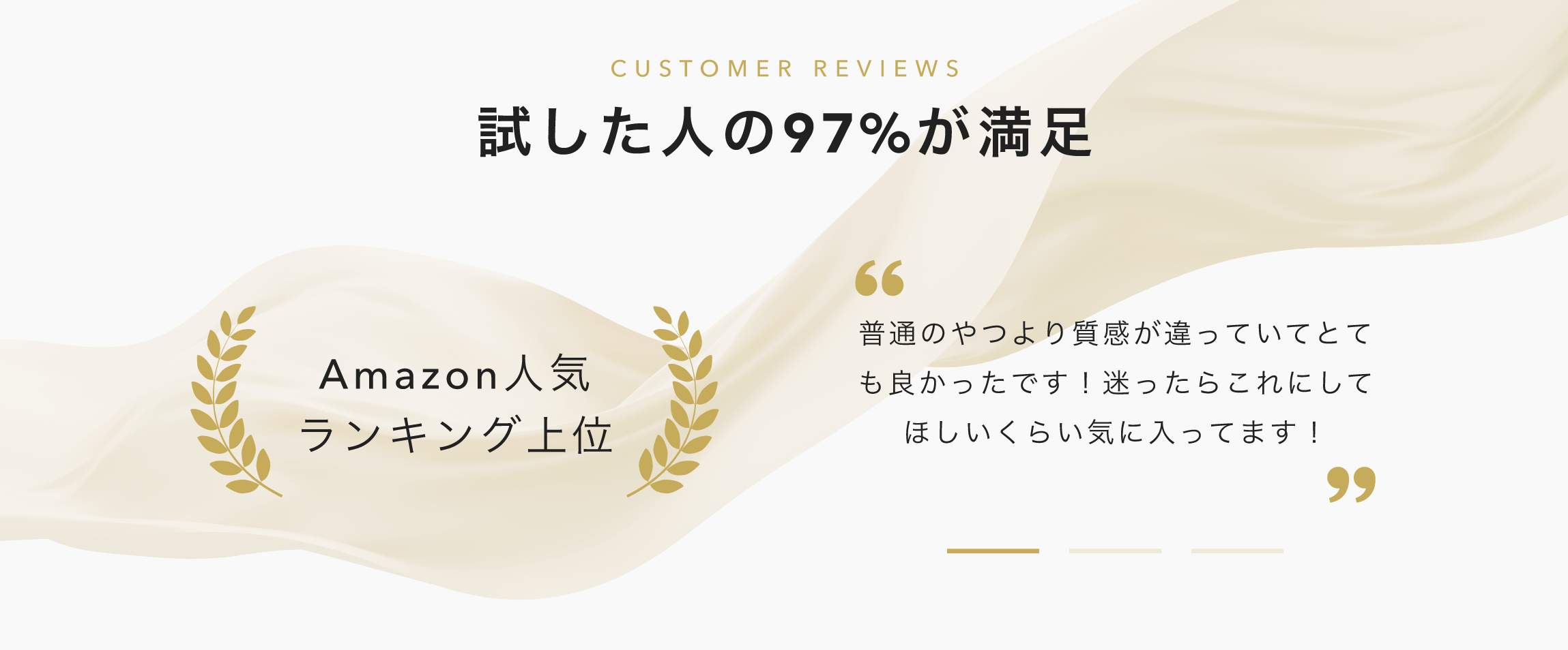
The revamped website became SKYN's primary digital touchpoint in Japan. A clearer product showcase, a more approachable brand tone, and a streamlined purchase flow — together with integrated campaigns — helped position SKYN as the #1 selling condom on Amazon Japan.
Beyond conversion, the redesign gave the brand a digital presence it could be proud of: one that treated sexual wellness as something positive and open.